NONNA VANDA
Brand identity
logo design
packaging design
BRAND STORYTELLING
The Challenge
Nonna Vanda is a toothpaste brand built around the idea that traditions and nature still have a place in modern life.
The brand required a full visual identity, from logo to packaging, that could express this philosophy. The challenge was to create a brand that felt authentic and rooted in tradition, while still appearing clean, contemporary and relevant to a modern audience.


The Creative Direction
The name Nonna Vanda pays tribute to the creator’s grandmother and the stories she shared during childhood. Those memories became the emotional foundation of the brand.
The toothpaste range was developed with natural ingredients and a strong respect for nature, so the visual direction needed to reflect both heritage and simplicity.
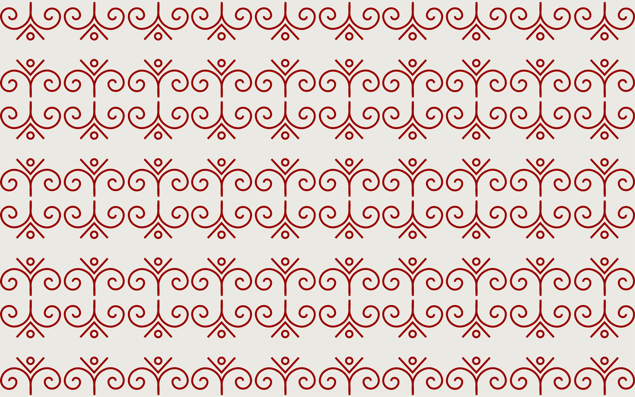
Inspiration came from Sardinia, the island where the story is set. Sardinia has a strong visual culture, rich in traditional patterns found in ceramics, textiles and folkloric clothing. These elements became the starting point for the brand’s visual language.
The Final Solution
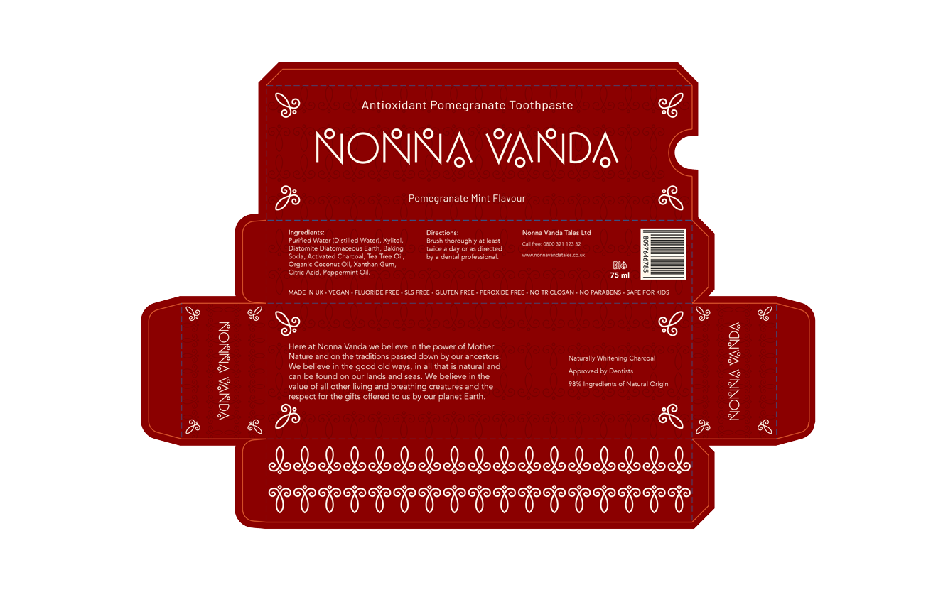
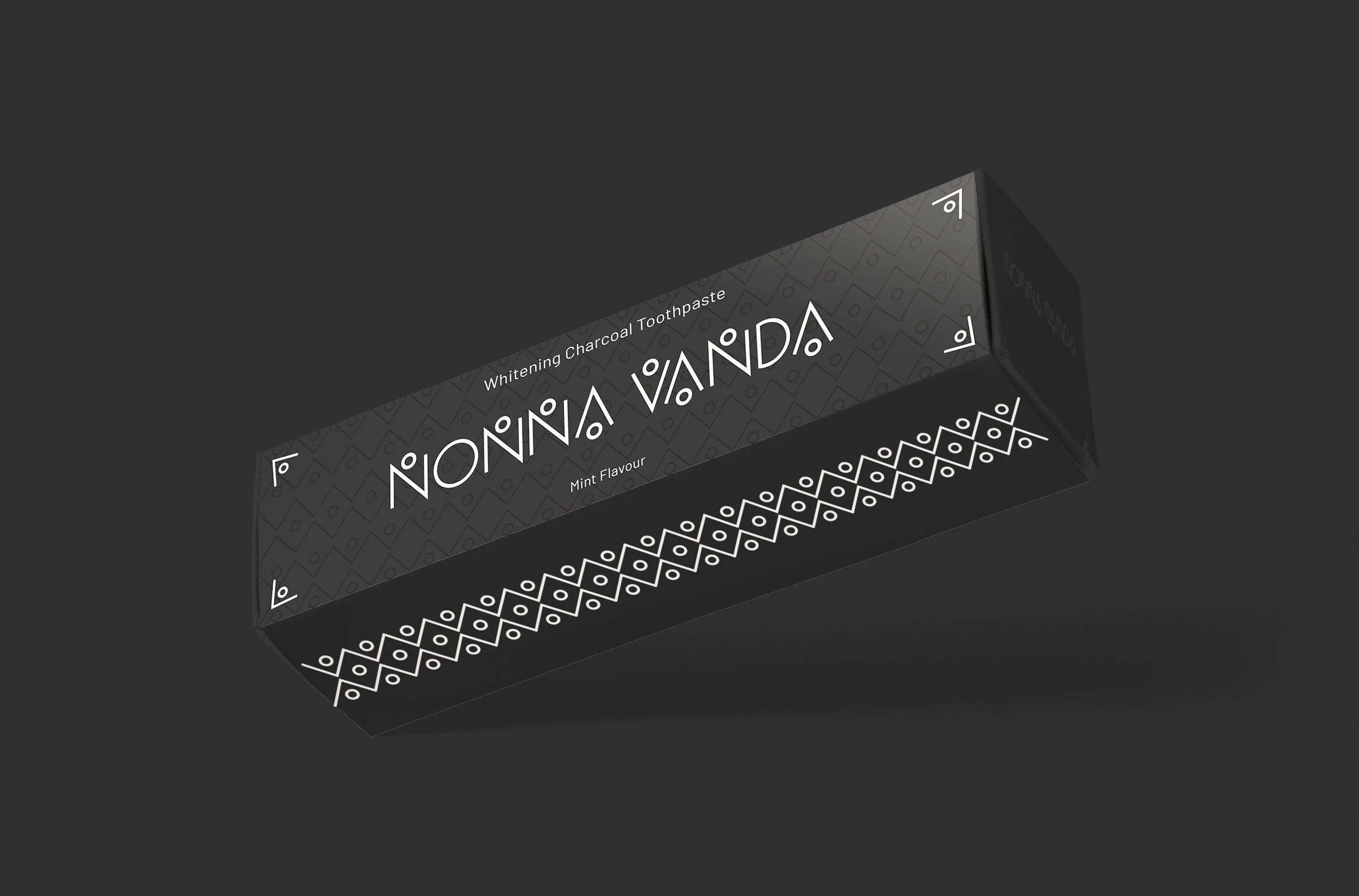
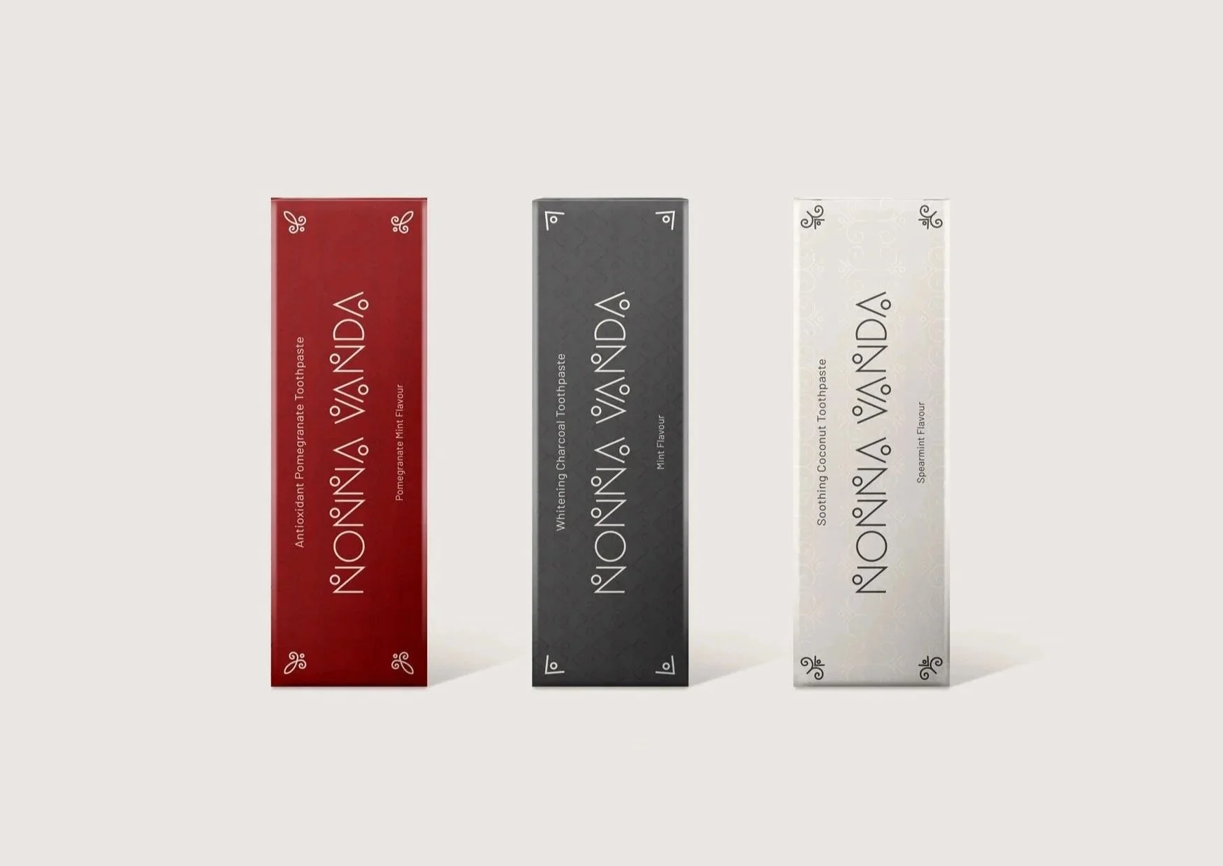
The visual identity draws heavily from Sardinian decorative traditions, translating them into a modern design system.
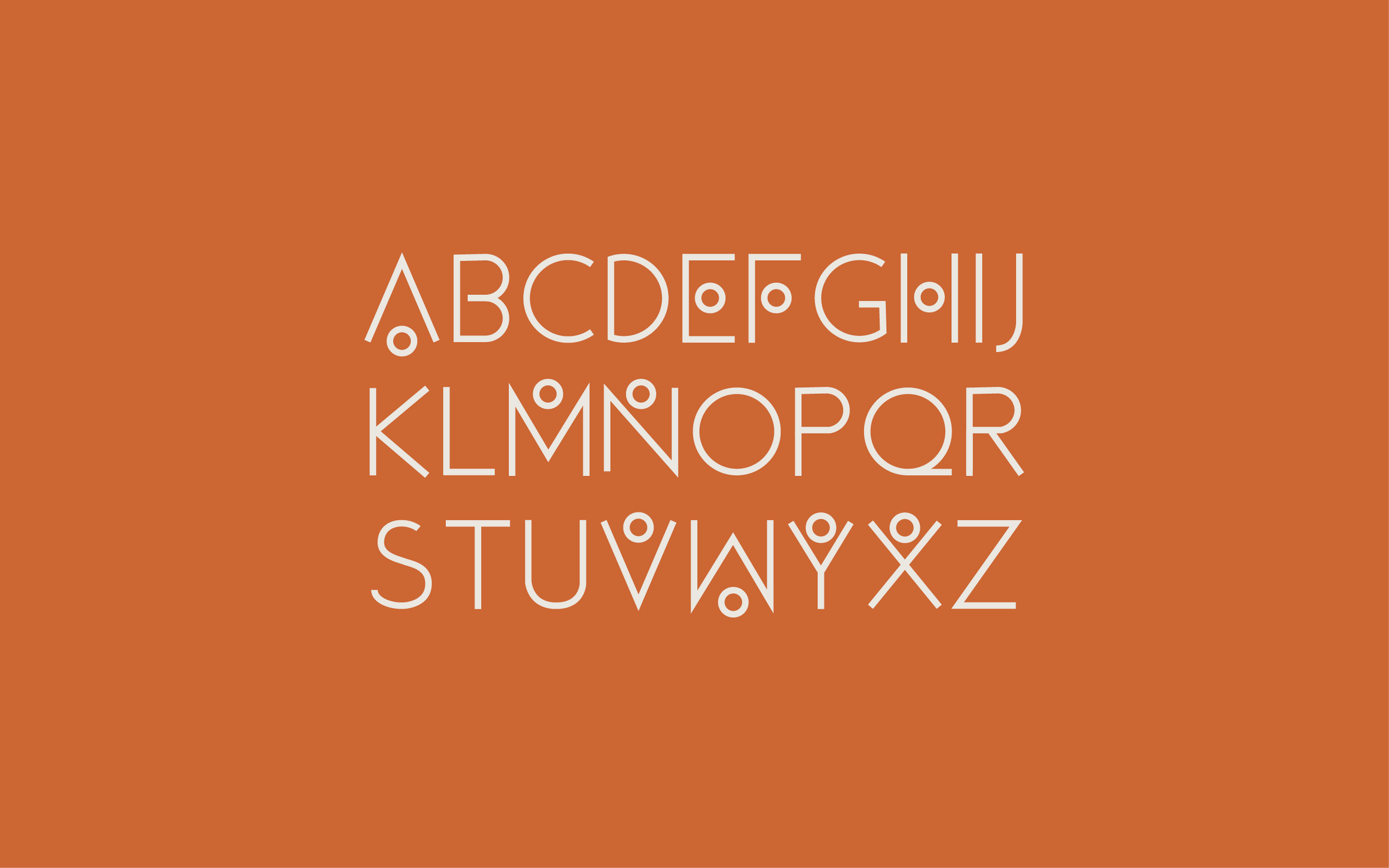
Geometric and floral motifs inspired by local patterns were incorporated into the packaging backgrounds, creating a visual link to the island’s heritage. These same elements influenced the creation of a customised type style for the Nonna Vanda logo.
The final result balances tradition and modernity. The packaging remains clean and minimal, allowing the decorative elements and storytelling to stand out while keeping the overall look fresh, simple and recognisable.