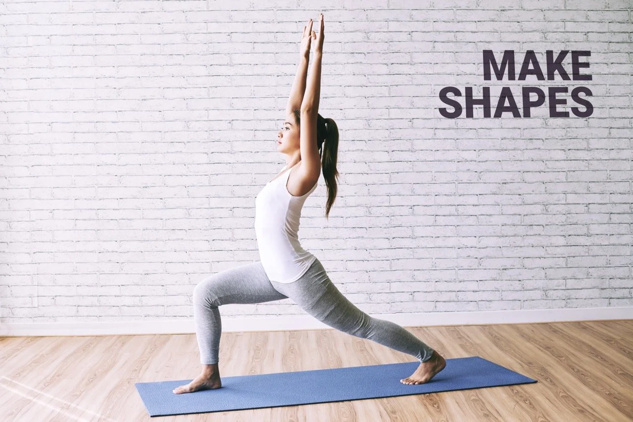
MAKE SHAPES
ADVERTISING CAMPAIGN
VISUAL IDENTITY
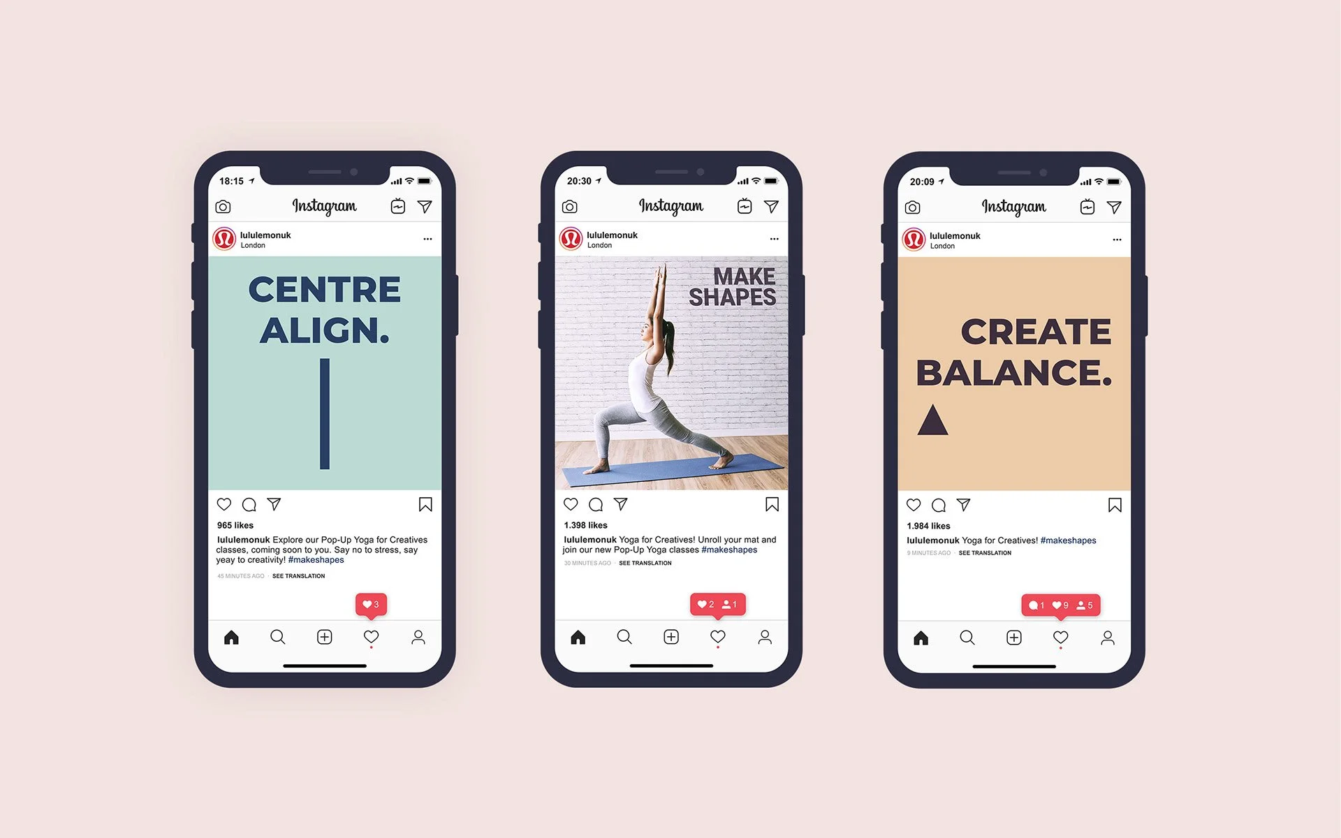
SOCIAL MEDIA DESIGN
PROMOTIONAL DESIGN
The Challenge
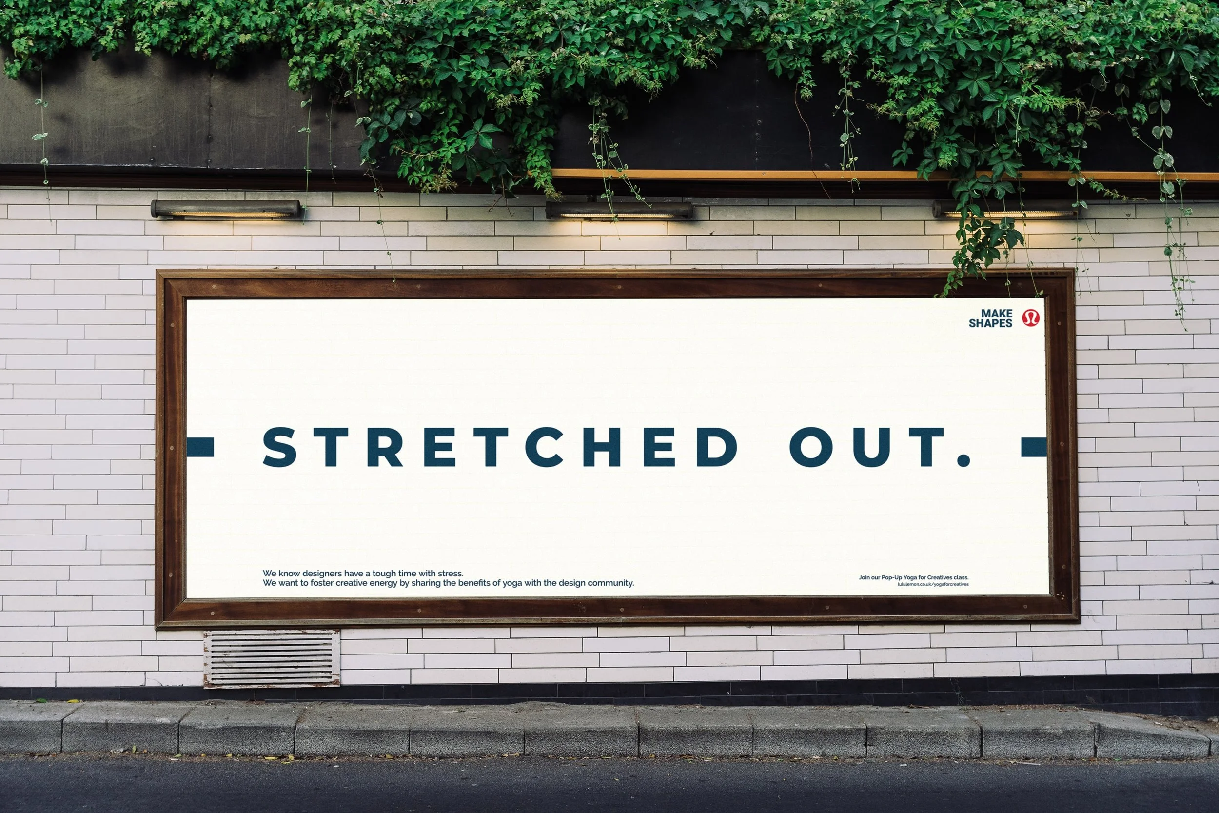
Advertising Campaign Design for Lululemon
Stress doesn’t just affect the body. It impacts clarity, focus and creative thinking.
In a time where self-care became essential rather than optional, the goal was to speak directly to designers and creatives whose work depends on mental space and imagination.
The challenge was to show how yoga could support not only wellbeing, but creative performance.
THE CREATIVE DIRECTION
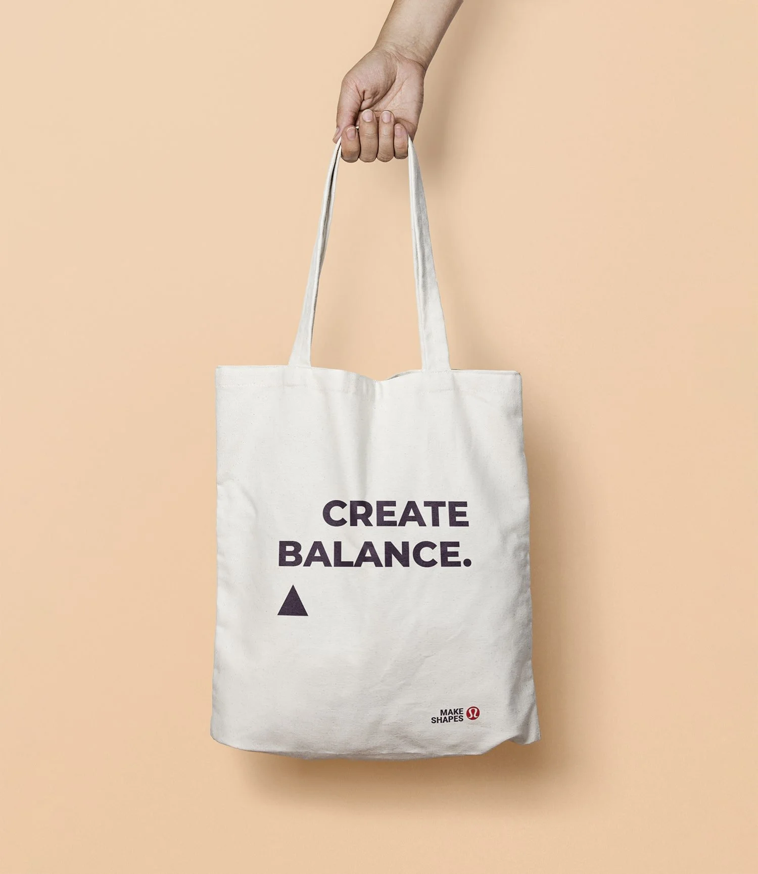
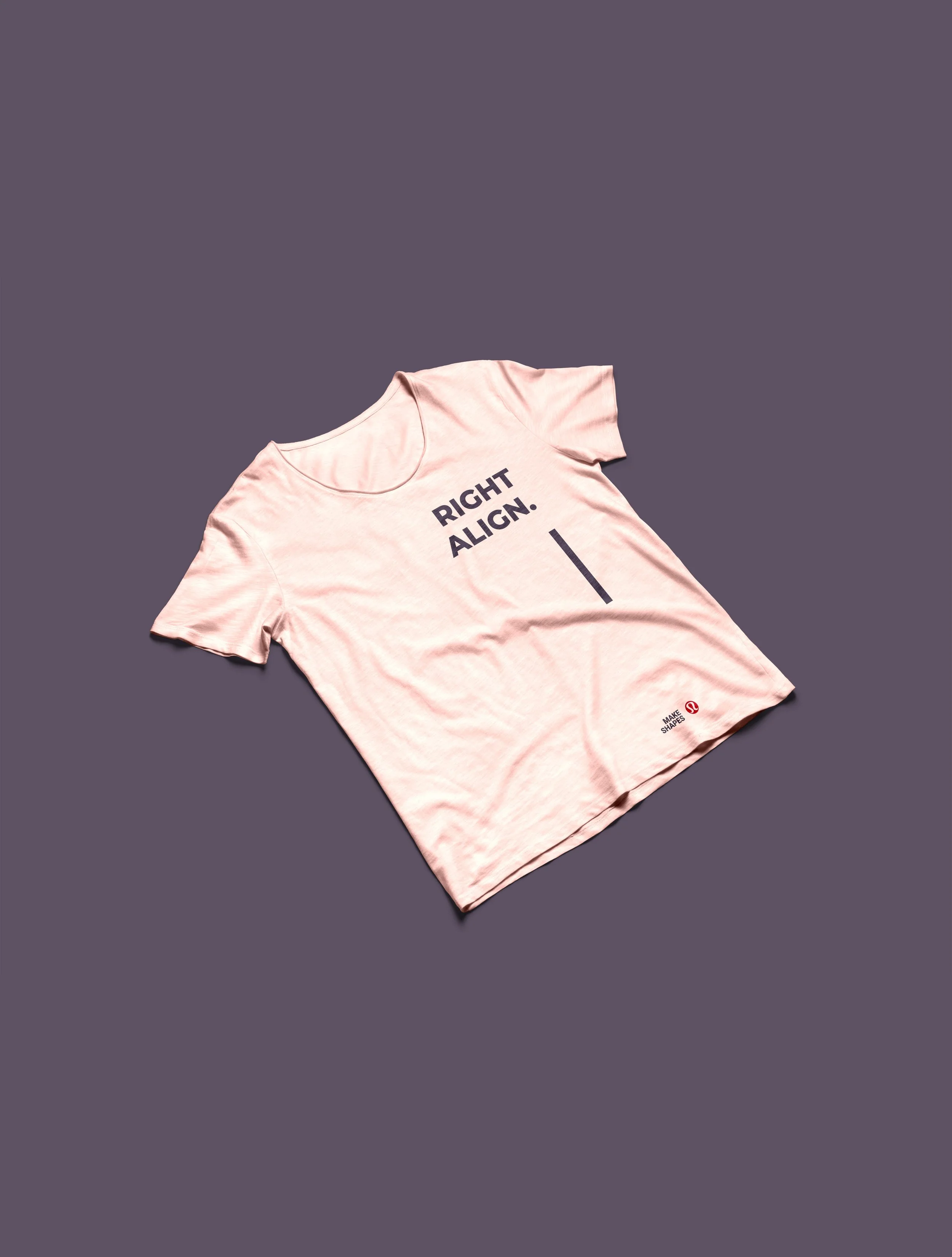
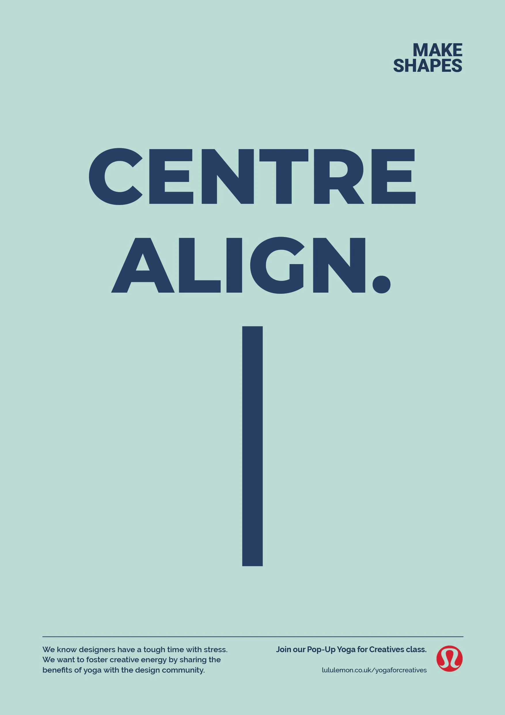
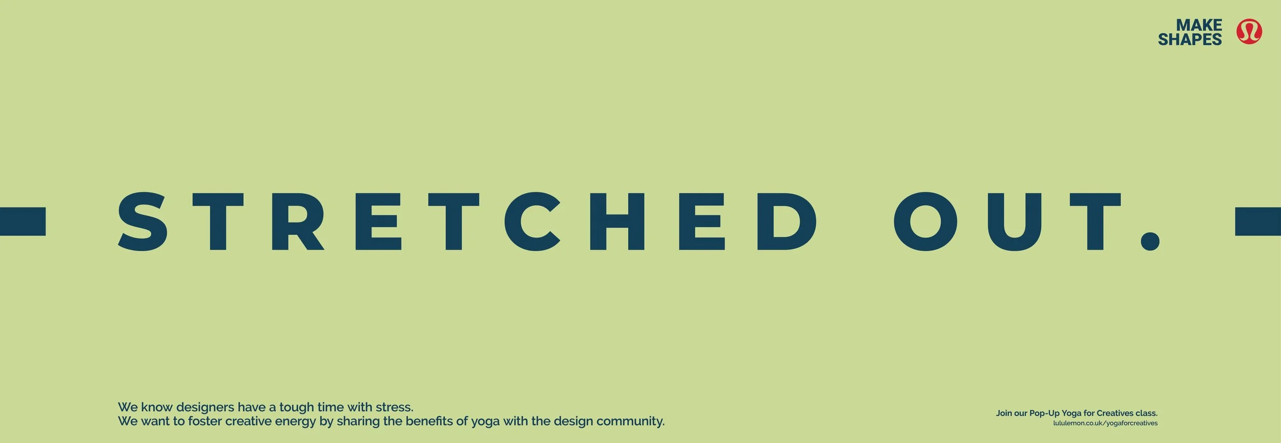
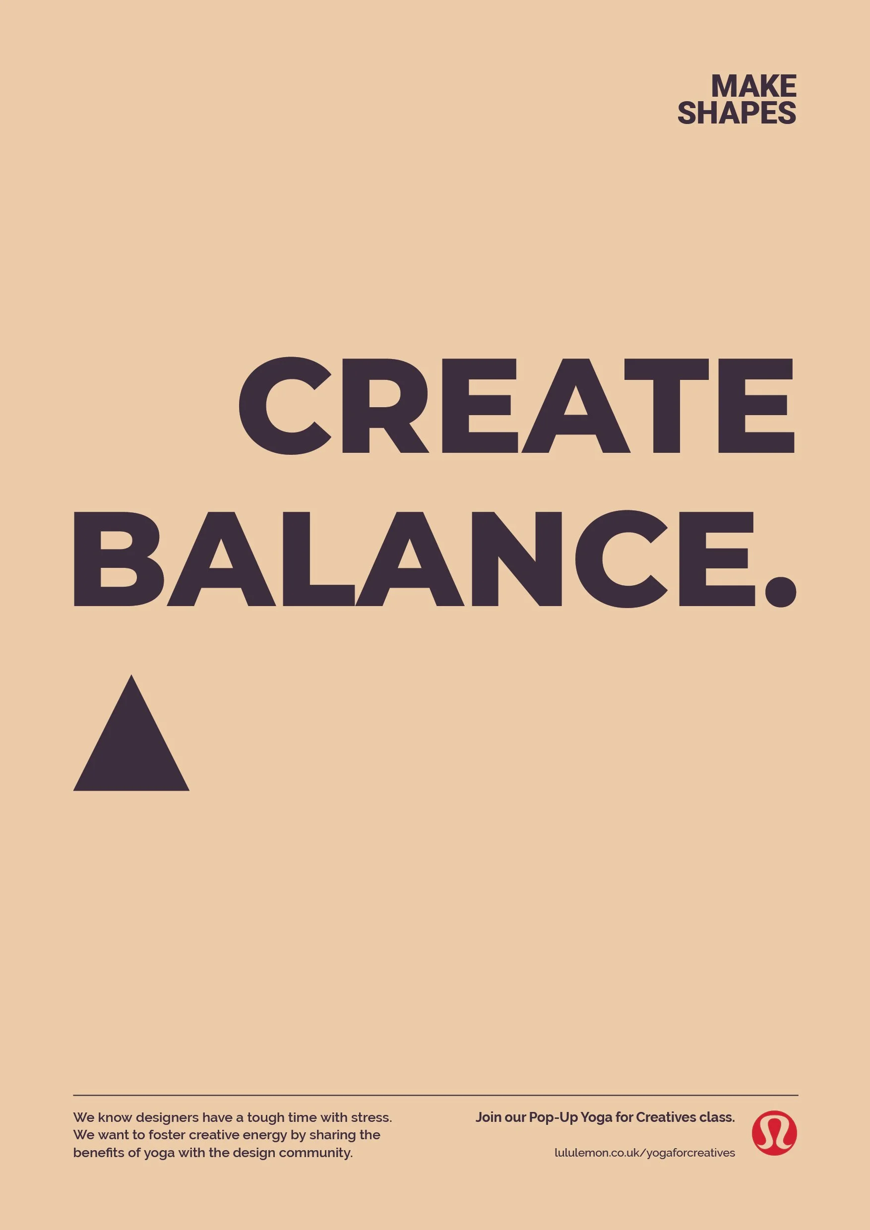
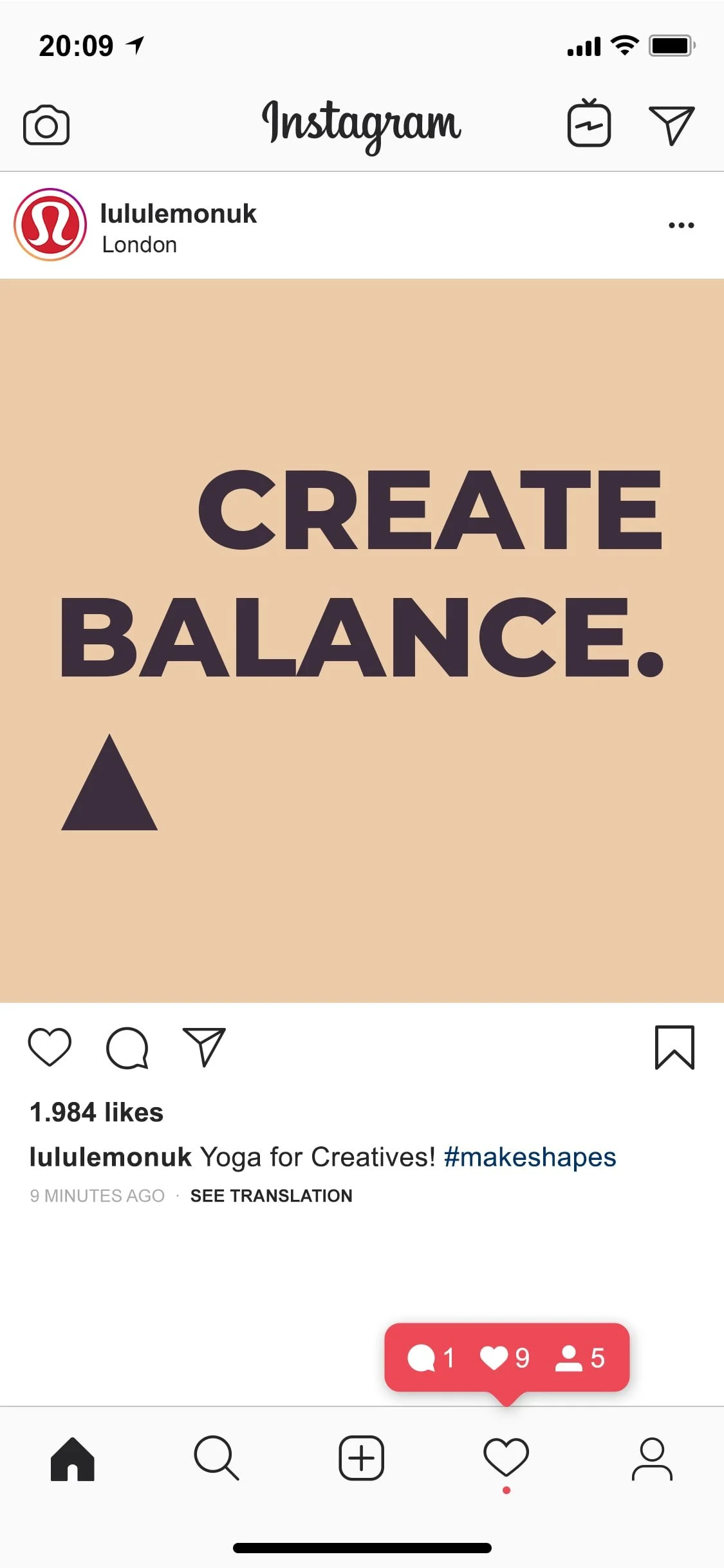
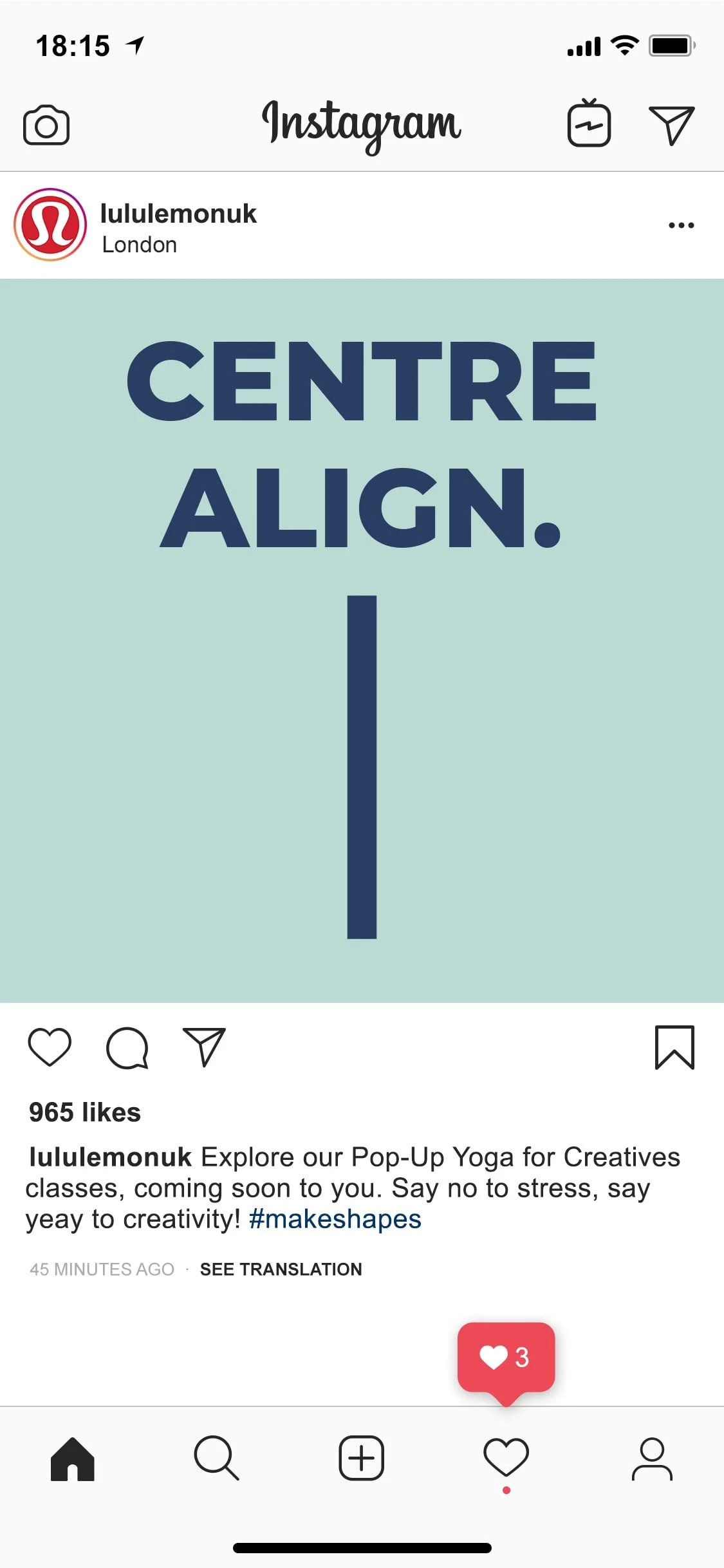
The concept “Make Shapes” connects two worlds that already speak a similar language: yoga and design.
Both rely on form, structure, balance and intention.
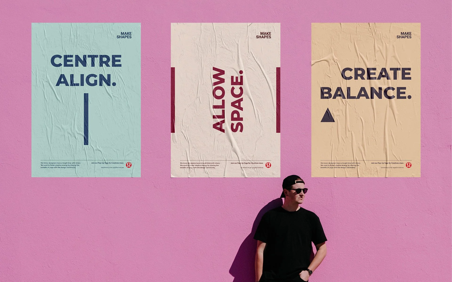
The direction focused on clear, direct messaging paired with simple geometric elements. The idea was to mirror the mindset we wanted to promote: less noise, more clarity. Strong sans serif typography created impact, while minimal layouts left room to breathe.
The tone was bold, honest and grounded, reflecting both the creative community and the yoga space.
The FINAL Solution
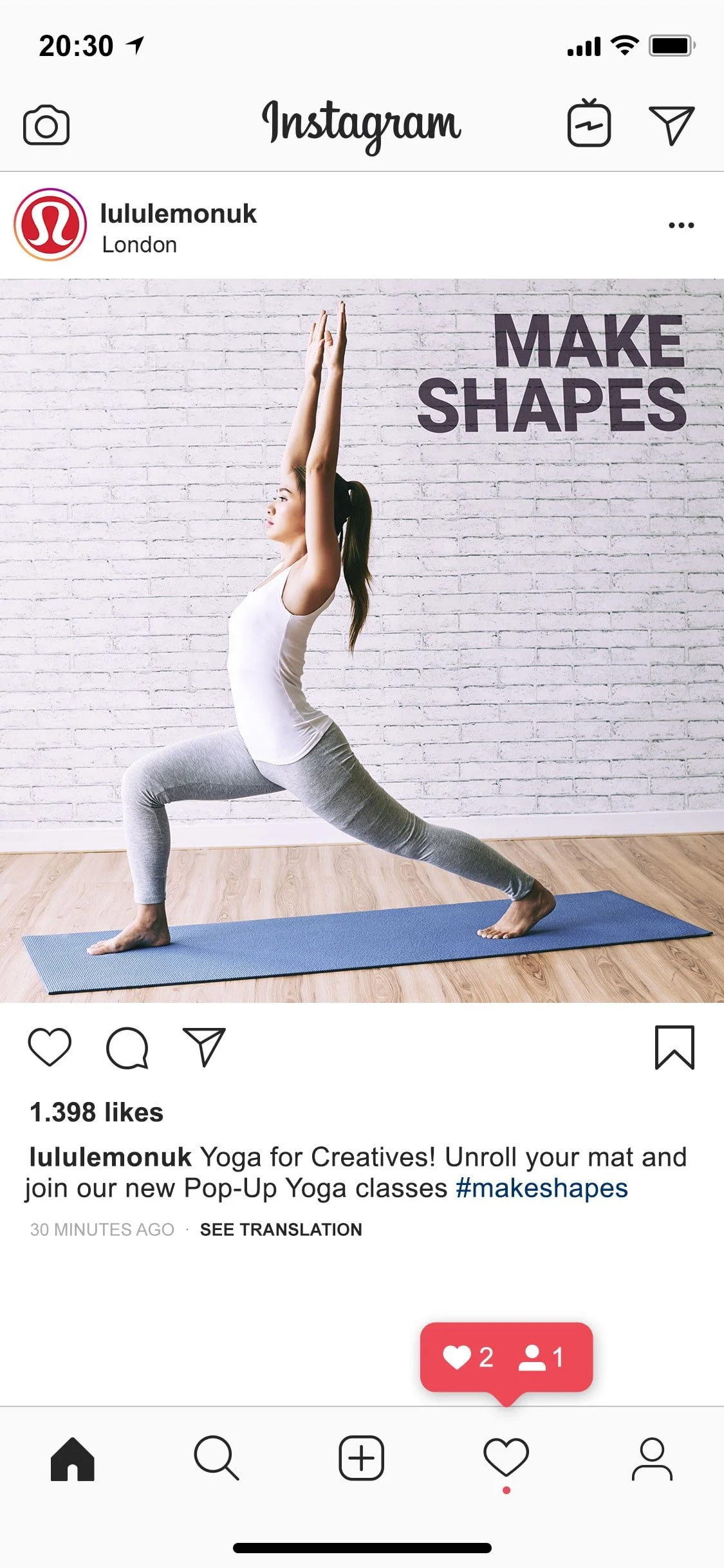
The campaign promoted a series of Pop-Up Yoga classes designed specifically for creatives.
The visual identity combined clean typography with simple geometric forms to represent both physical poses and graphic composition.
An earthy, calming colour palette reinforced the idea of balance and tranquillity, supporting the message that when stress is reduced, creative potential expands.
The result was a campaign that felt relevant, purposeful and aligned with the audience it aimed to reach.