kipa smile
The Challenge
Dental hygienists Chiara Tassia and Paola Trogu developed a professional teeth whitening treatment and needed a brand that would reflect both their expertise and the results their clients hoped to achieve.
The challenge was to create a visual identity that communicated trust, cleanliness and professionalism, while also expressing the confidence and joy that come with a bright smile.

The Creative Direction
The concept behind KiPa Smile centred on innovation and trust.
The brand needed to feel professional and credible, while also fresh and uplifting. Purple, blue and violet tones were chosen to introduce a sense of luxury and distinction, balanced with lighter shades that represent purity, hygiene and clarity.
The identity aimed to feel modern, vibrant and approachable, reflecting both the scientific care behind the treatment and the positive emotional result clients experience.
The Final Solution
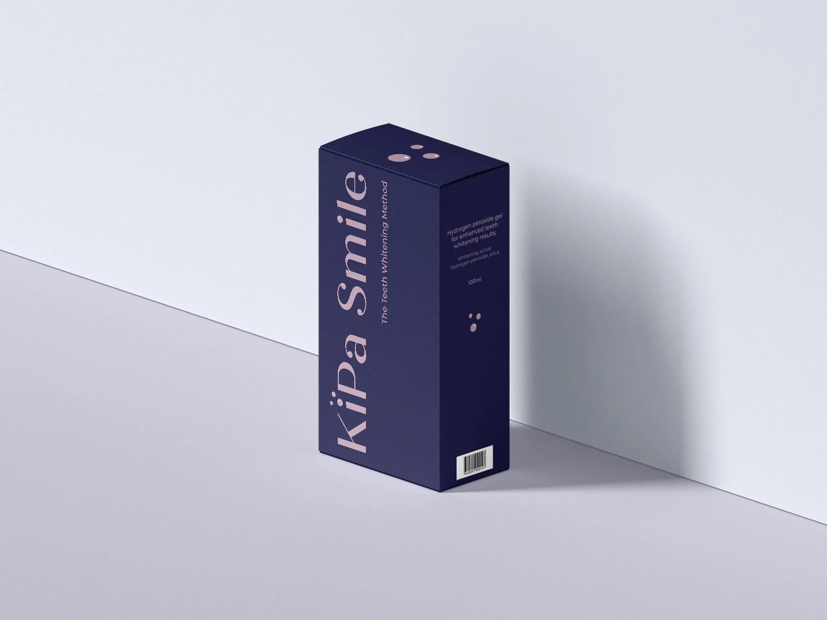
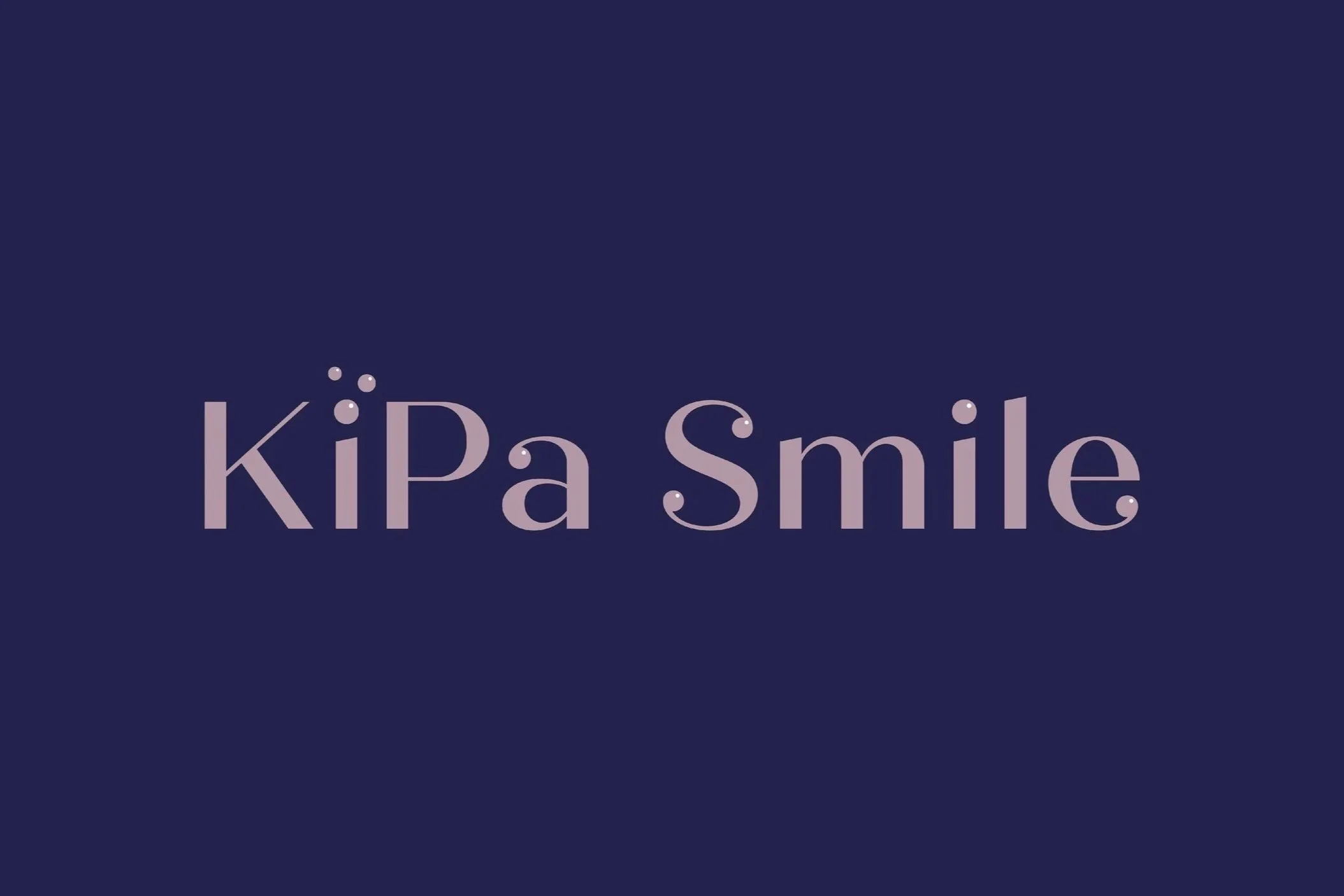
The logo merges the first syllables of the founders’ names, “Ki” and “Pa”, forming a distinctive and memorable brand name.
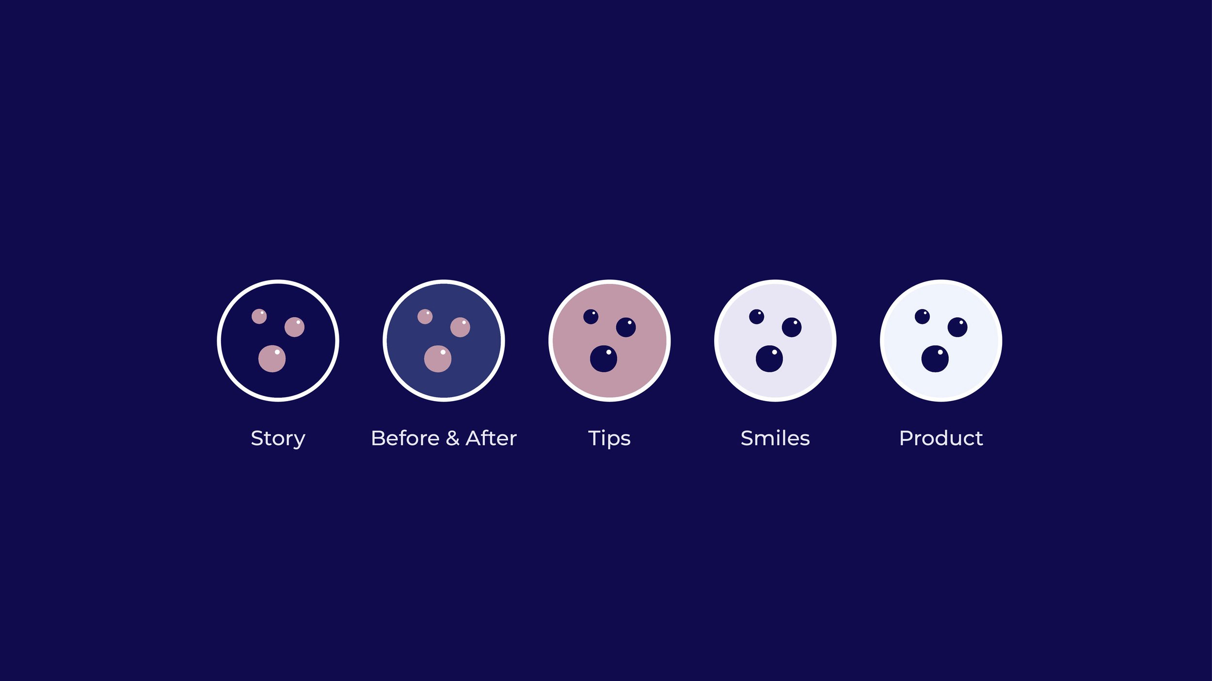
Three bubbles were incorporated into the symbol to represent the unique foaming action of the whitening product, creating a visual link between the brand and the treatment itself.
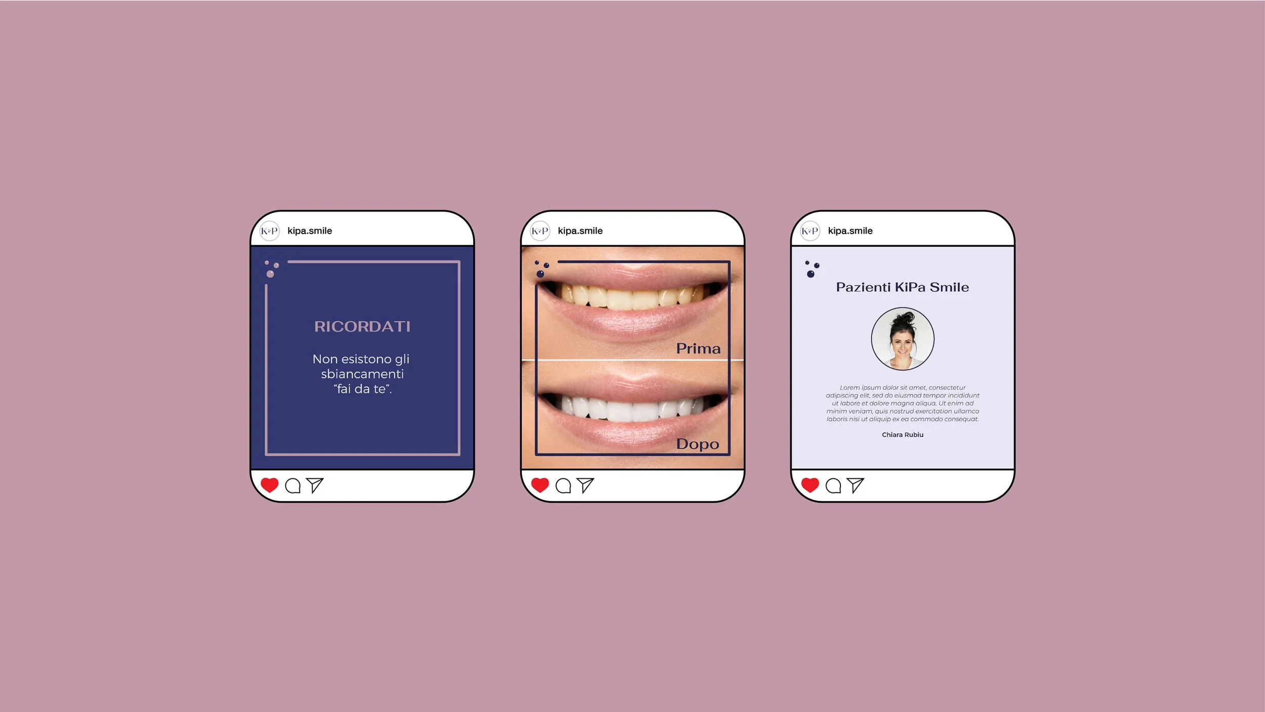
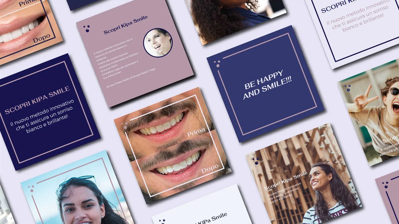
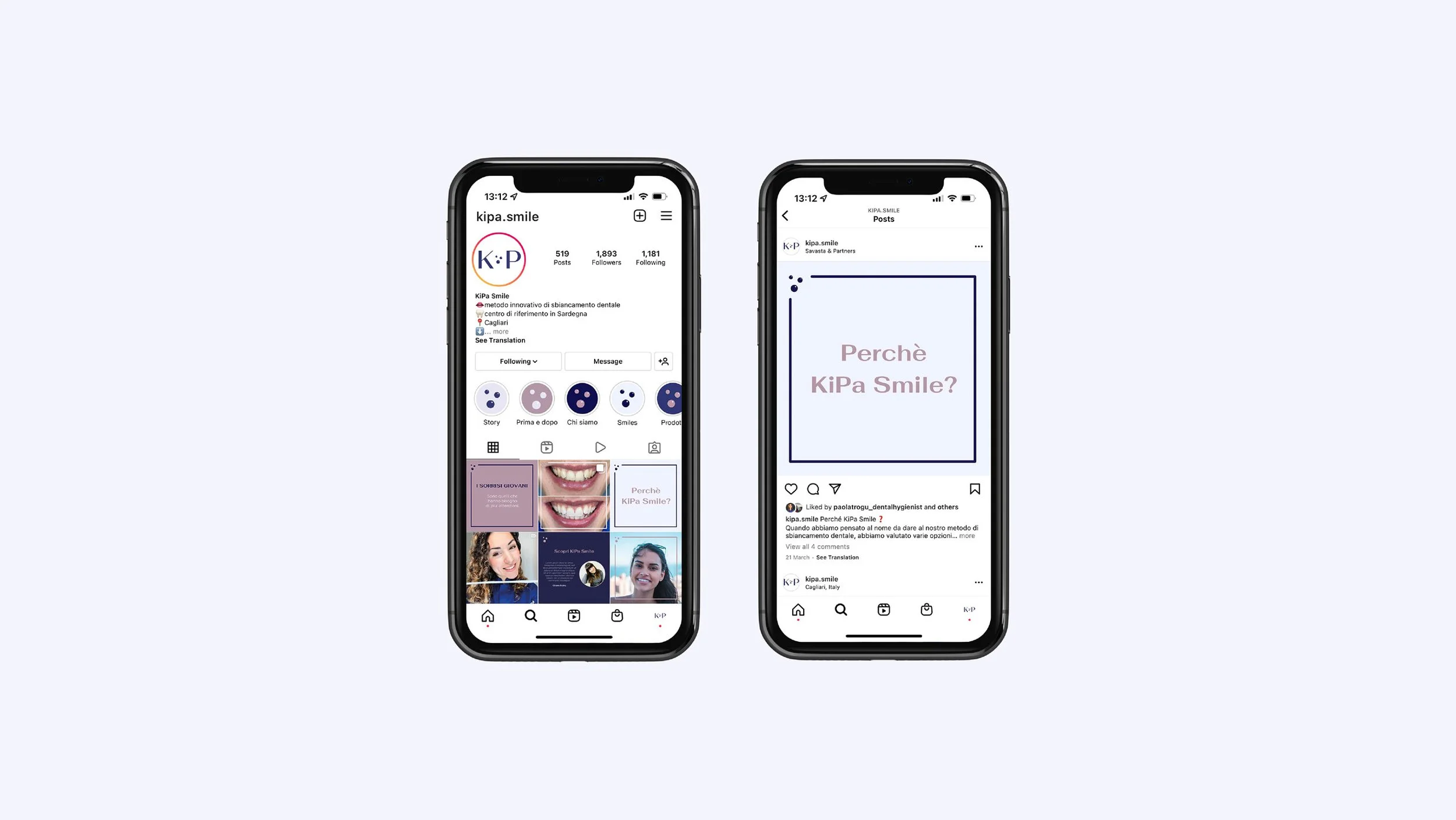
Beyond the logo, the visual identity was applied across key brand touchpoints. Packaging design was developed to ensure a consistent and professional presence for the product, while branded social media templates were created to support clear and recognisable online communication.
A brand book was also produced to guide the implementation of the identity, ensuring consistency across future materials and helping the founders maintain a strong and cohesive brand presence.